
As I wrote before I love typography! And for all the people who are interested in a better written language, I want to publish some easy to handle links for a better typography in the internet both in english and german.
1st Topic: Quotation Marks
The main point for me is to use the “correct quotation marks” instead of the "dumb quotations" or prime marks. Unfortunately they are used as quotations all over the world and they are ulcerogenic for professional eyes! Actually, they indicate inches and feet – and that’s all!
In the english language (and only in english!! For german e.g. read the german „Anführungszeichen“ article below, please), we have an opening and a closing character as follows:
“Hello” ‘Hello’
The single close quotes also serve as apostrophs:
It’s me, the apostroph.
HTML coding is
“ opening “ ‘ opening single ‘
” closing ” ’ closing or apostroph ’
French quotation marks
… in french
«Bonjour» ‹Bonjour›
… in german
»Bonjour« ›Bonjour‹
HTML coding is
« opening « ‹ closing single ‹
» closing » › opening single ›
Read more:
Thinking with Type
Thema 1: Anführungszeichen
Das Wichtigste sind erst mal gute Anführungszeichen. Wer die „echten“ statt den "doofen" benutzt, hat die halbe Miete drin! Das sieht edler aus und der Betrachter hat gleich einen besseren Eindruck.
Im Deutschen nehmen wir ein anführendes Zeichen zu Beginn und zwar unten [doppelt „ oder einfach ‚] sowie ein ausführendes am Ende des Ausdrucks [doppelt “ oder einfach ‘]. Beispiel:
„Hallo“ ‚Hallo‘
Auf KEINEN FALL benutzen wir vorne und hinten das Inch- oder Zollzeichen ["]! Im englischen heißen die „Dumb Quotes“, was ich gerne mit „Idiotenanführungszeichen“ übersetze.
Das ist die HTML-Codierung
„ doppelt unten „ ‚ einfache unten ‚
“ doppelt oben “ ‘ einfache oben ‘
Im Englischen sind beide oben, haben aber – anders als im Deutschen – öffnenden und schließenden Charakter:
“Hello” ‘Hello’
In HTML schreibt man
“ doppeltes oben “ ‘ einfaches oben ‘
” doppeltes oben ” ’ einfaches oben ’
Übrigens benutzt man das englische einfache Anführungszeichen oben auch als korrektes Apostroph im Deutschen wie im Englischen:
Hans’ Auto At the Butcher’s (Shop)
Apropos Apostroph: Um im Deutschen die „totale Apostrophe“ zu vermeiden, sollte man sich tunlichst ins Thema einlesen und die entstellenden Apostrophe an jeder noch so unpassenden Stelle künftig vermeiden! Leider zieht die so genannte Apostrophitis wie die neue Pest durchs Land. Das ist nicht schön, das ist einfach nur schlimm!!! Ein ganz herrliches Gruselkabinett findet man beim Apostrophen-Alarm.
Zum Schluss die französischen Anführungszeichen.
Man unterscheidet zwischen französischen Anführungszeichen im Französischen mit „rahmendem Charakter“
«Bonjour» ‹Bonjour›
und den französischen Anführungszeichen im Deutschen mit „zwickendem Charakter“.
»Bonjour« ›Bonjour‹
Die zweite ist also die richtige Version für deutschen Text und der HTML code sieht folgendermaßen aus
« links schauend « ‹ links schauend einfach ‹
» rechts schauend » › rechts schauend einfach ›
Weiterführende Links:
Wolfgang Beinerts Typolexikon
Typografie im Netz
... link

... link
... link
to be continued…
... link
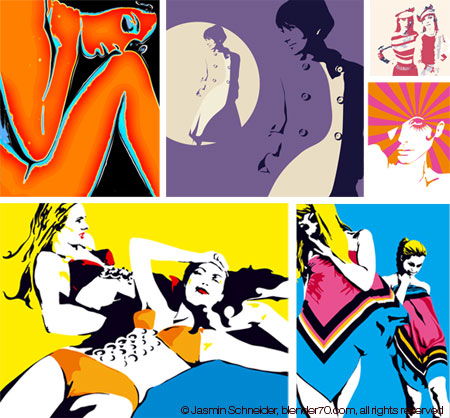
About me
Some of them I paint Acrylic on Canvas. This is one of my favourite, it is called “Schöne Schurken (Nice Guys)” and it is hung up in our flat next to the dinette.
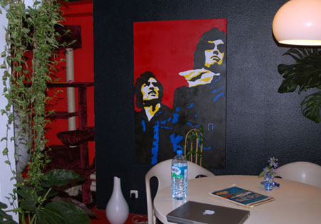
Title: Schöne Schurken; 90 x 140 cm
Some may say my stuff is kind of retro – well I love the 60s – but I have to admit, I don't like the common retro wave. It is too mainstream for me and I don’t intend to copy stuff, I just want to create fresh nice things. Anyway I'm addicted to colour and form, think this is the common ground I share with designers of the 60s and that’s the way I like it!
Further on I love cats and I have 3 of them: Gustav (white Persian), Luder (black ESH) and Marotzke, called Rosi, a silver-shaded BSH tom-cat.
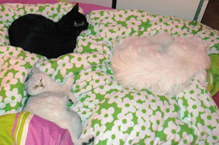
They devil me sometimes, okay, but I really like them to be so cool and easy, so beautiful and perfect – they are my inspiration – love it!
... link
May 2026 |
||||||
Mon |
Tue |
Wed |
Thu |
Fri |
Sat |
Sun |
1 |
2 |
3 |
||||
4 |
5 |
6 |
7 |
8 |
9 |
10 |
11 |
12 |
13 |
14 |
15 |
16 |
17 |
18 |
19 |
20 |
21 |
22 |
23 |
24 |
25 |
26 |
27 |
28 |
29 |
30 |
31 |